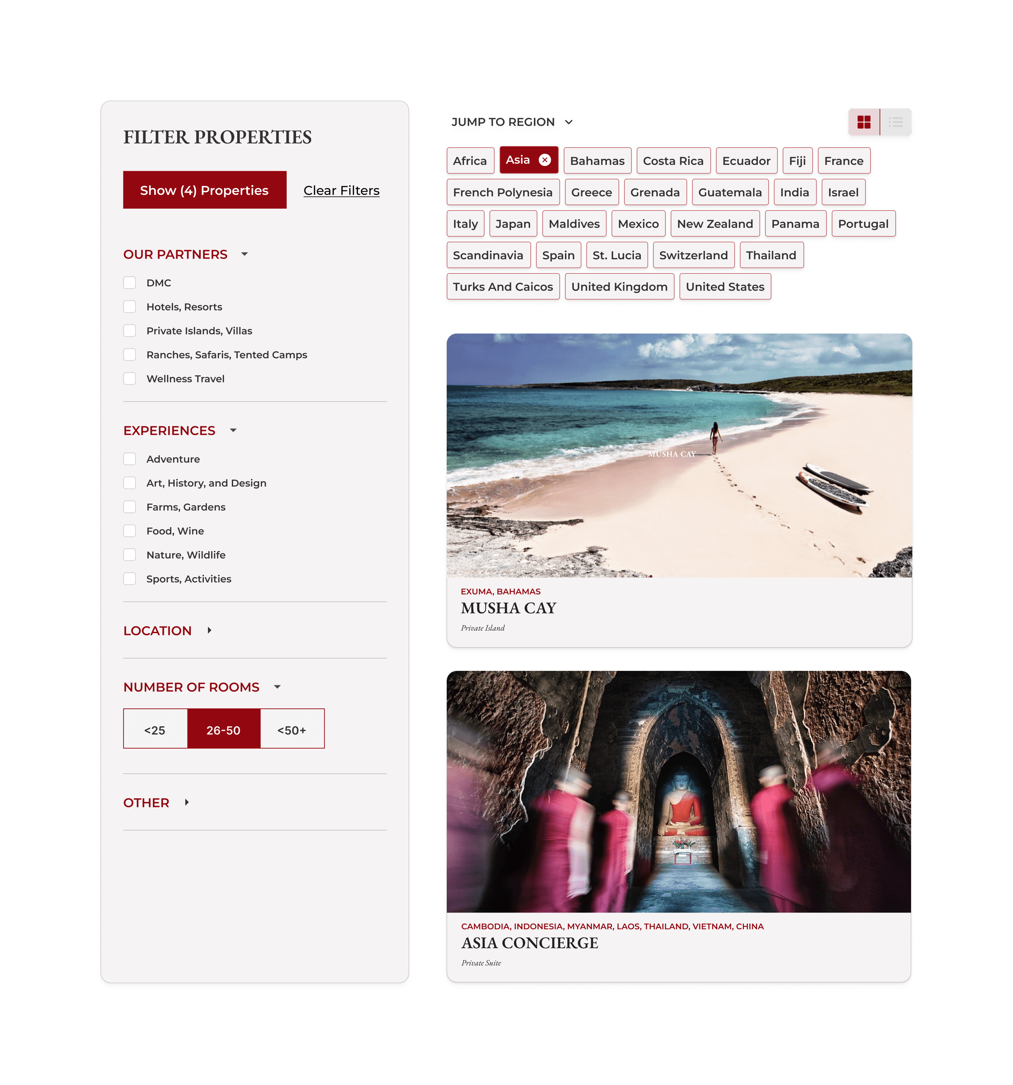
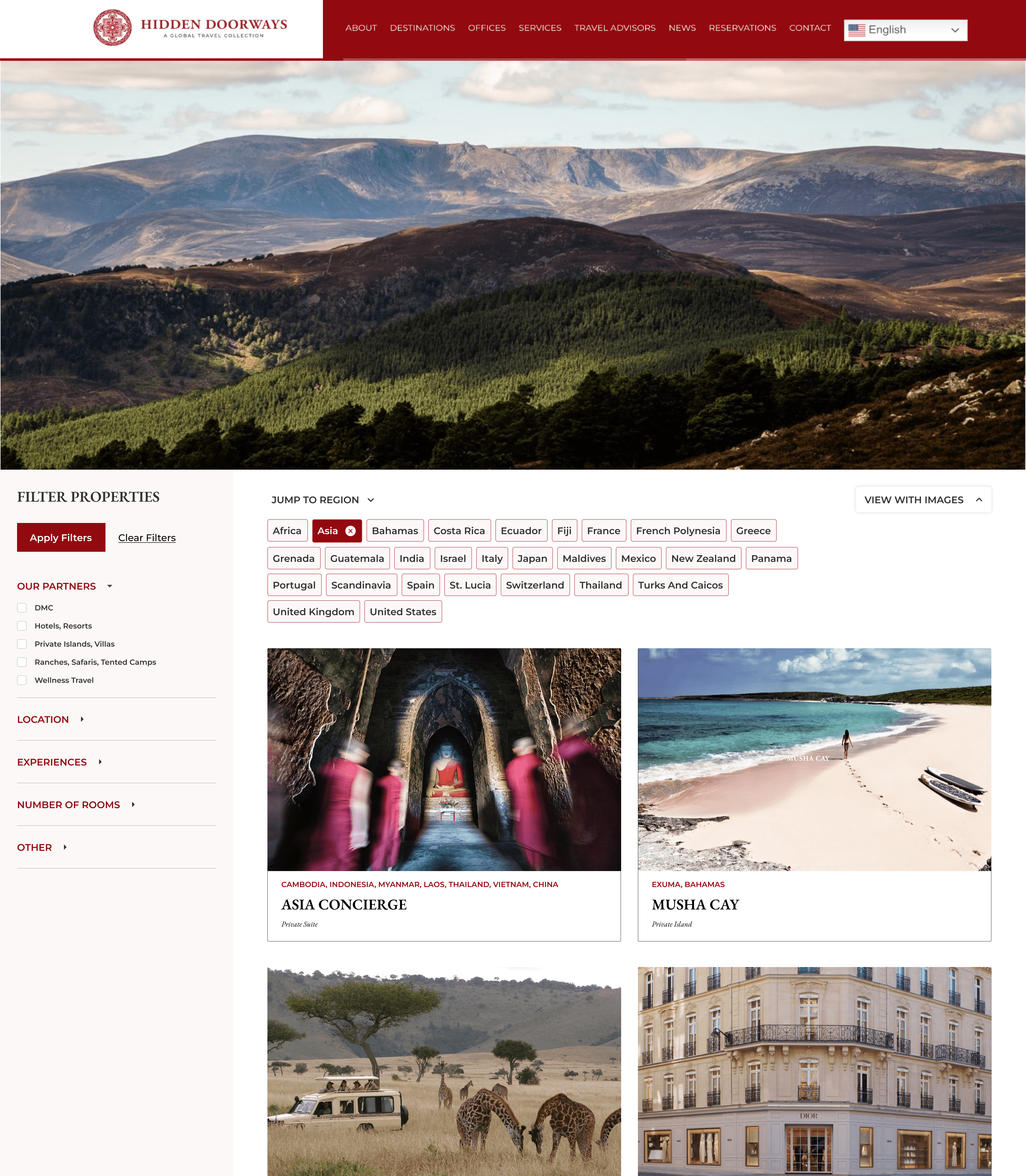
Filters and Cards
Overview
The client, Hidden Doorways, requested a redesign of their filtering system to enhance user experience and provide additional filtering options. The existing setup lacked versatility and did not cater to the needs of users - browsing images was not supported, and it was hard for users to find what they were looking for.
Our solution included:

Card View
Users can more intuitively filter based on geographic region, adding a layer of granularity to searches.

List View
Users can easily navigate and apply filters without disrupting their main viewing area.

Left Rail Filter
Users can easily navigate and apply filters without disrupting their main viewing area.

Region Tiles
Users can more intuitively filter based on geographic region, adding a layer of granularity to searches.
Client Background
Hidden Doorways offers a high end travel experience. Their customers are travel agents and brokers, representing individuals and families seeking unique travel destinations and experiences.
Requirements
Expanded list of filters and subcategories
Introduce cards with images for a more visual search experience
Maintain the preexisting list format for long-time users
Responsive design that works for mobile experiences
Design Solution
After reviewing competitors filtering patterns and working through several card and filtering designs, we came up with a solution that accommodated list and card view, and one that was friendly to multiple screen resolutions.
2
3
1
1
Left Rail Filter
We introduced a left rail filter, and accordions per filter category. With a dynamic counter in the "Apply" button, users can avoid null results and recieve system feedback.
2
Region Tiles
The original destinations page grouped places by country, creating many single item categories. Now users can filter results by region in both card and list view.
3
Select view dropdown
We implemented a “Sort By” style dropdown menu to allow users to switch between card and list view. Veteran users can choose to view destinations by list.