

ROI Calculator
Overview
We (my manager and I) worked with our client, Minoa, B2B Saas start-up serving salespeople, in a 2 week sprint to redesign their ROI Calculator, a tool to help salespeople more quickly and easily arrive at value propositions within their business cases.
The overarching goal of this sprint was to increase the number of business cases created. In uncovering barriers to users creating business cases, we identified the ROI calculator as a major sticking point. Its block layout was not intuitive for users who are used to representing equations horizontally. Its interface did not support exploration, and overall it was difficult to quickly edit calculations.
Our new calculator featured:

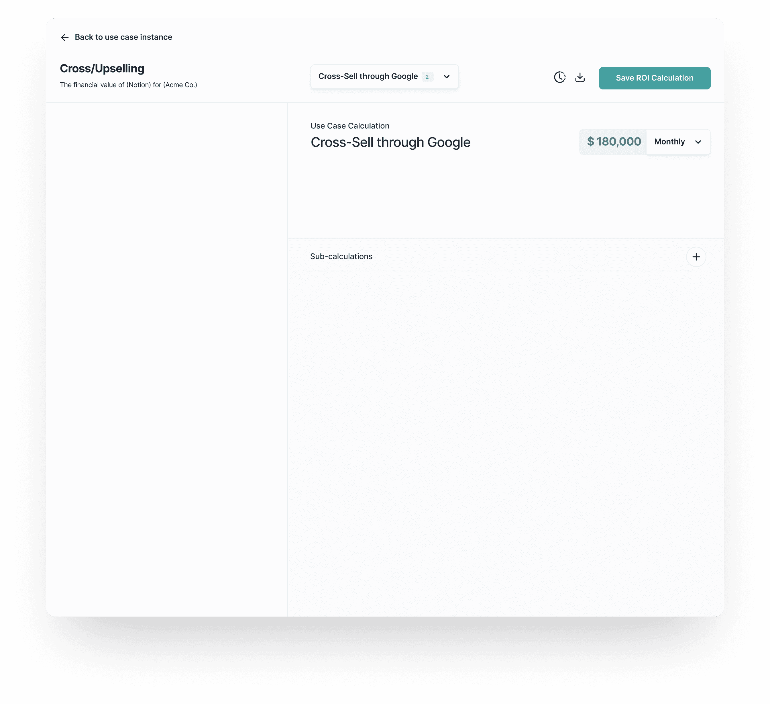
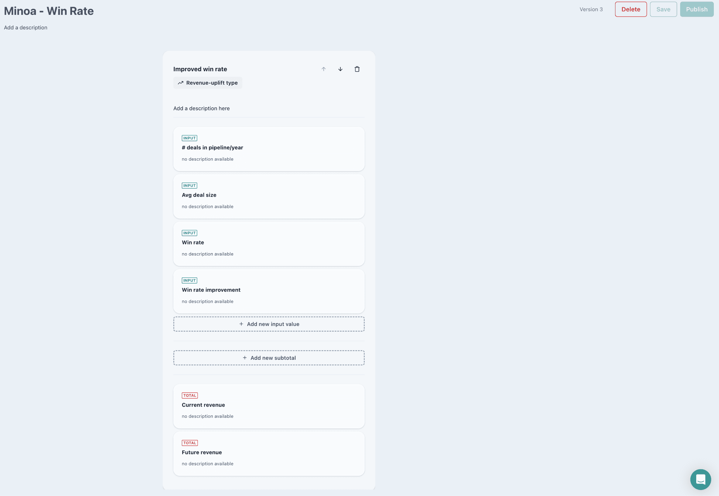
Formula Bar
Build calculations horizontally in a formula bar. Enter operators, search and select inputs and subcalculations in the formula bar.

Top Down/Bottom Up Workflows
Users with diverse workflows are supported in the new design, whether they start with configuring inputs, or the formula.

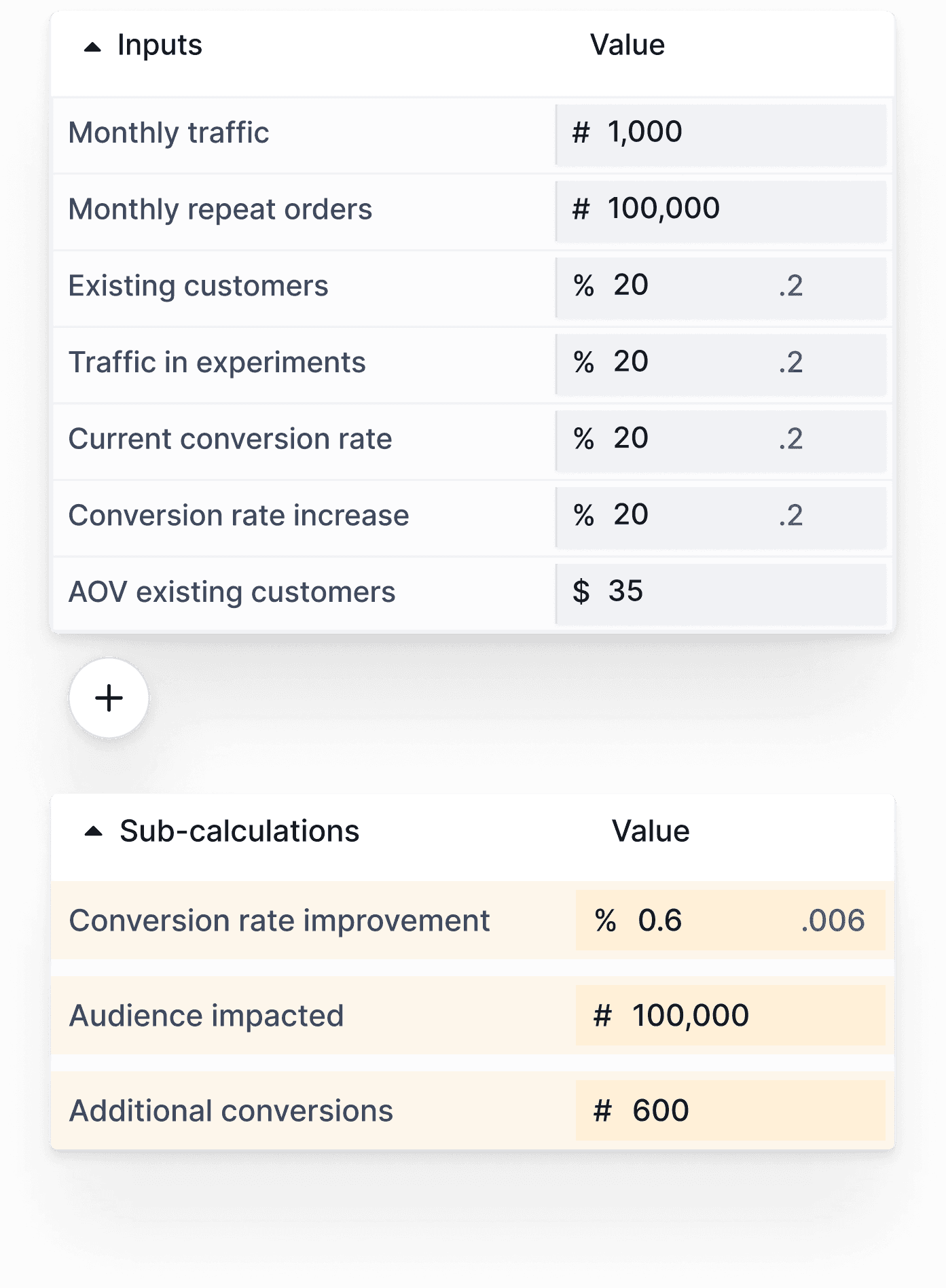
Increased visibility and usability
Easily see, add and edit inputs, subtotals and formula bar outputs, all at once.

Explore, tinker and play
Duplicate calculations and revert to old versions, edit inputs in a spreadsheet-inspired UI and see the overall output change.
Client Background
Minoa is a value intelligence platform that helps B2B sales teams create collaborative business cases: turning complex ROI spreadsheets into clean, shareable documents that sellers co-create with their prospects.
The ROI Calculator helps salespeople make a financial case for what they're selling, using current and projected numbers to illustrate how their product will either reduce costs or improve revenue.
Requirements
Research
Existing Solution Audit
1
2
3
Customer Interviews
Competitive Research
Design Solution
After my competitive research, aspects of our solution space seemed clearer. Keeping an eye on our requirement to accommodate current functionality, I started by figuring out how to translate an existing Minoa ROI calculation into a new interface based on my competitive comparison learnings, something with a large centered workspace, and formula bar.
A couple of rounds of iteration and a UI skinning pass later, we arrived at our final design. Called out here are the major areas of change from initial wireframe to final, and why we made those decisions.

